sarmth
Active Member
Hi guys.
So, I've been living underneath a rock for some time now, and only recently heard about these Responsive Website Designs (apparently google looks favourably on them :wink2
Considering this, I did some research and came across twitter bootstrap, as well as font-awesome and a jQuery image slider named unslider. So, I thought, "why the heck not".
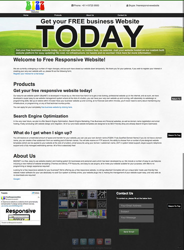
After a bit of playing around, I came up with the following responsive website design (my first responsive website design) which took little to no time, and was overall very easy to develop.
http://bizz.net.au/bizzDesign/test.html
Using jQuery, I have developed a little DIV scroll to top of page which displays when the viewer has scrolled down, the navigation links scroll down the page to the appropriate section, in the footer, there is space for social media links, twitter feed, flickr gallery and various other "goodies".
What do you think?
Design loosely based off Produkta, using 5 produkta components which are relatively easy to change. The two images in the slider, the pattern above the slider, and the two patterns (body, and footer) This design is an example only, and was coded from the ground-up, only 5 items were sourced from a previous design which for distribution purposes would need to be amended as I did NOT make those 5 components.


